Online death registration
Reshaping the process for one of life's most difficult experiences. Please note that this case study mentions death and dying.
Work for the Ontario provincial government. November 2020 – May 2021. Lead UX researcher & designer.
Problem
Over 115,000 Ontarians passed away in 2020, and each of these unique deaths went through the same mandatory death registration process. Death registration allows grieving families to bury their loved ones, close billing accounts, and settle estates. Federal and provincial governments also rely on accurate death-related reporting in healthcare planning.
Unfortunately, death registration in Ontario is paper-based, slow, and full of duplicate work between medical, funeral home, and municipal staff. The end-to-end process takes 6 weeks to complete (on average), and delays leave families waiting to say goodbye to their loved ones. Paper forms are also prone to error, which retraumatises families months later when a company or government office rejects an incorrectly-written death certificate. Meanwhile, the users involved all consider mounting deathcare paperwork a distraction from their real jobs.
Our team (including my amazing co-UX designers Myuri Thiruna and Diane Robertson, as well as 4 program and business analysts) knew that a revamped, digitally-focused process could help if implemented carefully.
How could we build an online death registration system that made things better for 3 distinct user groups and grieving families?
Process
Learning about deathcare in Ontario
Discovery around this project focused on 3 core user groups working directly with death registration documents: medical practitioners (including both doctors and coroners, who would take over medical investigation in specific cases), funeral directors, and municipal staff processing forms. I joined the project in time to help develop the discussion guide and facilitate 1:1 discovery interviews with 30+ medical practitioners in Ontario who had experience with death registration.
From previous team members, we had access to past work that had been done with funeral home and municipal staff. I led synthesis sessions where our team used open qualitative coding to come up with themes applicable to our medical practitioner work, and then bring in findings from other sessions to determine overarching themes.
Key issues included:
- Timeliness: Writing, picking up, and mailing forms takes time. Many municipalities batched up their death registration documents and mailed them out every 1-2 weeks, causing delays for families seeking death certificates. The delays caused by mailing out documents also led to issues with timely death data for federal and provincial care investigators and policymakers.
- Accuracy and consistency: Paper forms have no built-in validation, so errors or missed fields often snuck through the process until it was time to transcribe the forms at the federal statistical level (triggering document recalls and delays). Or, different professionals used different terms or addresses to describe the same conditions or places.
- Trust and relationship issues: A recent series of negative stories involving death registrations (e.g. forms being lost in the mail enroute to Statistics Canada and never recovered, stories of bereaved family members waiting 7 months for a death certificate because some paperwork had been misplaced or misunderstood) created distrust among stakeholders, which compounded as COVID-19 illness and deaths placed increased stress on medical and deathcare professionals.
If you're interested, I consolidated all of our research into a deck here.
A path and principles to guide us
Through our interviews and related research work; I learned a lot about the contexts in which medical professionals, funeral directors, and municipal workers worked and their interactions with families. Families are largely shielded from the death registration process, unless something goes wrong along the way. As such, they became a key secondary stakeholder to consider rather than our primary user group.
To make our findings digestible and applicable to process improvement; I made slide decks, user proto-personas, and journey maps. Here's an example of a detailed journey map for a coroner's death registration journey (1 of 3 types of medical practitioner sub-journeys):
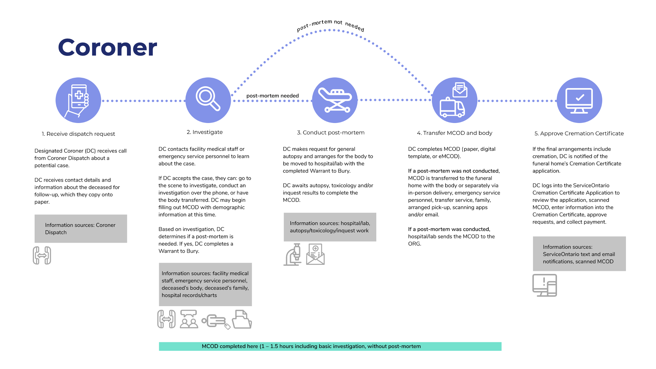
Click to enlarge
Maps like the one above usually showed things at a more detailed view than we needed for design activities. So, I also created simplified current and future state maps for conceptual decision-making:
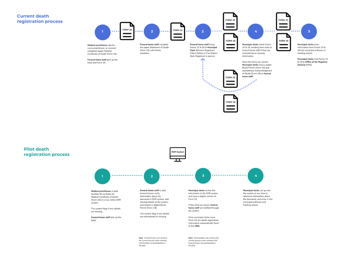
The current death registration process compared to our proposed online pilot (named, not by our choice, EDR)
Finally, I led our team through an activity to build research-backed design principles for our new online death registration system. This was an introduction to most of the team to this concept and why it was important. Our new system would be:
- flexible and adaptable to situations like mobile phones, low-connectivity settings, and unusual document journeys
- lean and efficient, removing redundant steps and feeling faster than a paper form to all users
- big picture-focused on improving data quality
- a facilitator for communication between stakeholders, making it easier to get a hold of people or information they need than a phone call or an office visit
Co-designing our screens and systems
Our design process began with the usual suspects: inspiration from other national and subnational death registration systems from around the world. I also got our team to branch into patient case management and funeral home management software to get a feel for the types of interfaces that deathcare professionals were familiar with. Since our users typically used desktop computers, we departed from mobile-first in order to prioritise this experience.
Our project team planned to pilot the beta online death registration system in a few specific communities across Ontario. I convinced the product manager that it made sense to involve interested medical, funeral, and municipal staff in these areas with our work early: to shape our overall direction and help us refine our mid-fidelity designs.
After working with our team to prioritise our key questions, I led co-design workshops with 5-10 members of each of our 3 user groups to shape the details of our mid-fidelity designs (e.g. error message styles and interactions, questions per page, dashboard style).
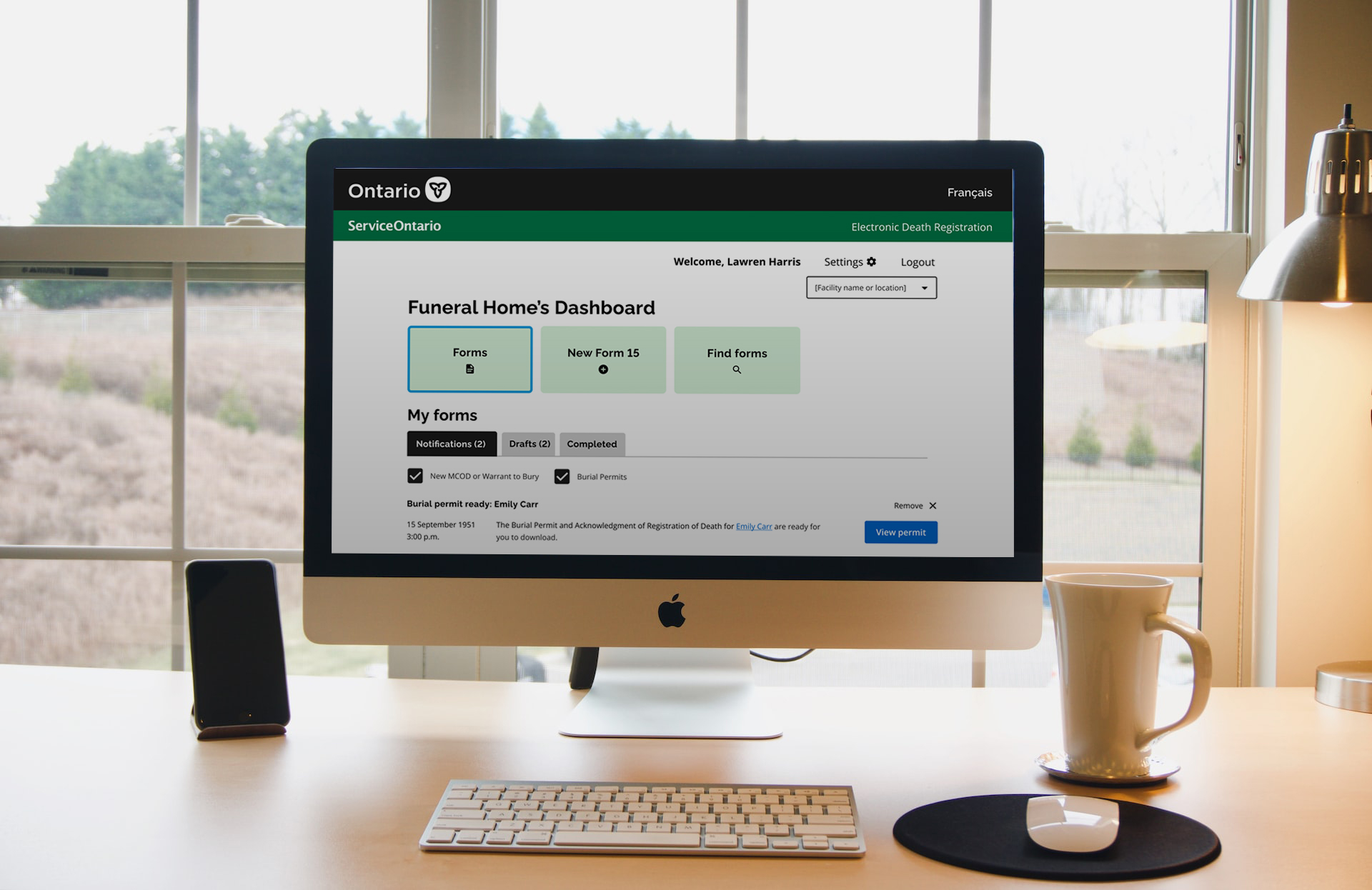
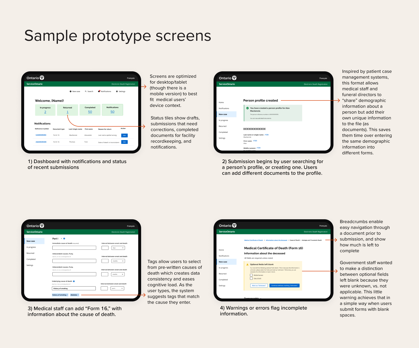
Here are some sample screens from our workshopped prototype:
Examples of screen options our users discussed in workshops
Holding on to the essentials
This project was an exercise in balancing thoughtful design with legal and business constraints. My first wireframes were based on case management systems, with all 3 user types adding information to one shared profile of the deceased person. We had many discussions with leadership about the usability advantages of this format, but they couldn't accept it from a legal liability perspective (even if each user's changes were logged in detail), so I adapted.
The new flow had each user create their own document, and then match it to the documents created by other users if available. Understanding that misspellings of names or date transpositions can happen, match suggestions happen even if a document is not a perfect match. Users are able to review details, and unmatch a document anytime before they submit.
To balance the burden of users entering repetitive information across documents, we revisited and streamlined some of the other steps in the system that could add burden to users. For example, we compromised with the business area team to lower the burden of nagging about empty fields (which were "nice to have" for policymakers and annoying for everyone else). We also revisited steps, adding more selective disclosure to hide and automatically populate fields that are irrelevant (for example, hiding pregnancy-specific questions from people safely outside of the pregnancy age range).
I also successfully fought (going up to the business team director and senior IT levels) for a departure of the business team's long-standing practice of using postal code-based address lookup in all of their online products, in favor of Google Places Autocomplete (for local addresses) and combo boxes that mimic autocompletion (for lists, like countries or facility types). While consistency with the team's other products would have been conceptually nice, research clearly showed that deathcare practitioners (especially coroners and hospital staff, with limited information about the deceased person) usually didn't have information about relevant postal codes.
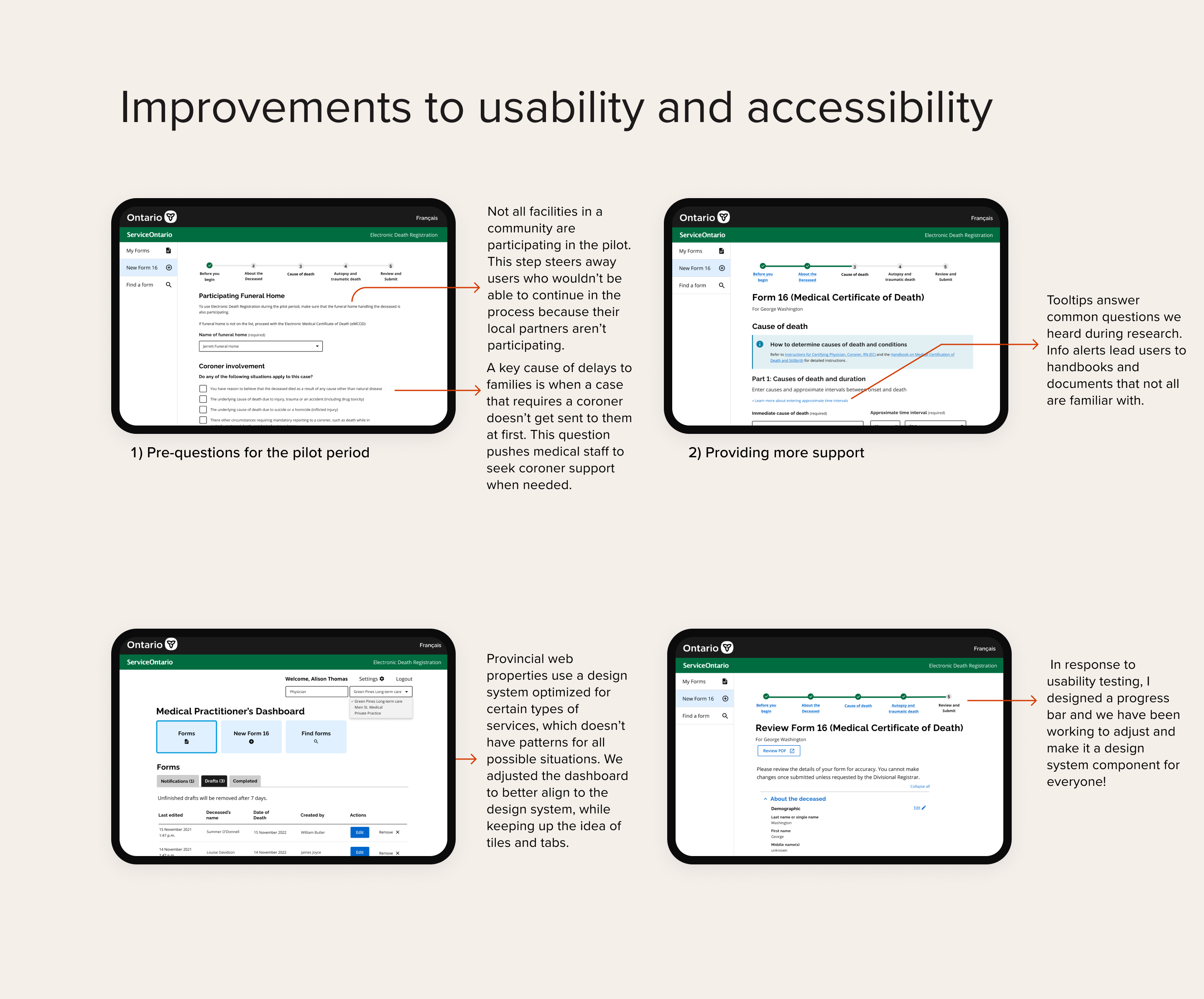
Refining with usability testing
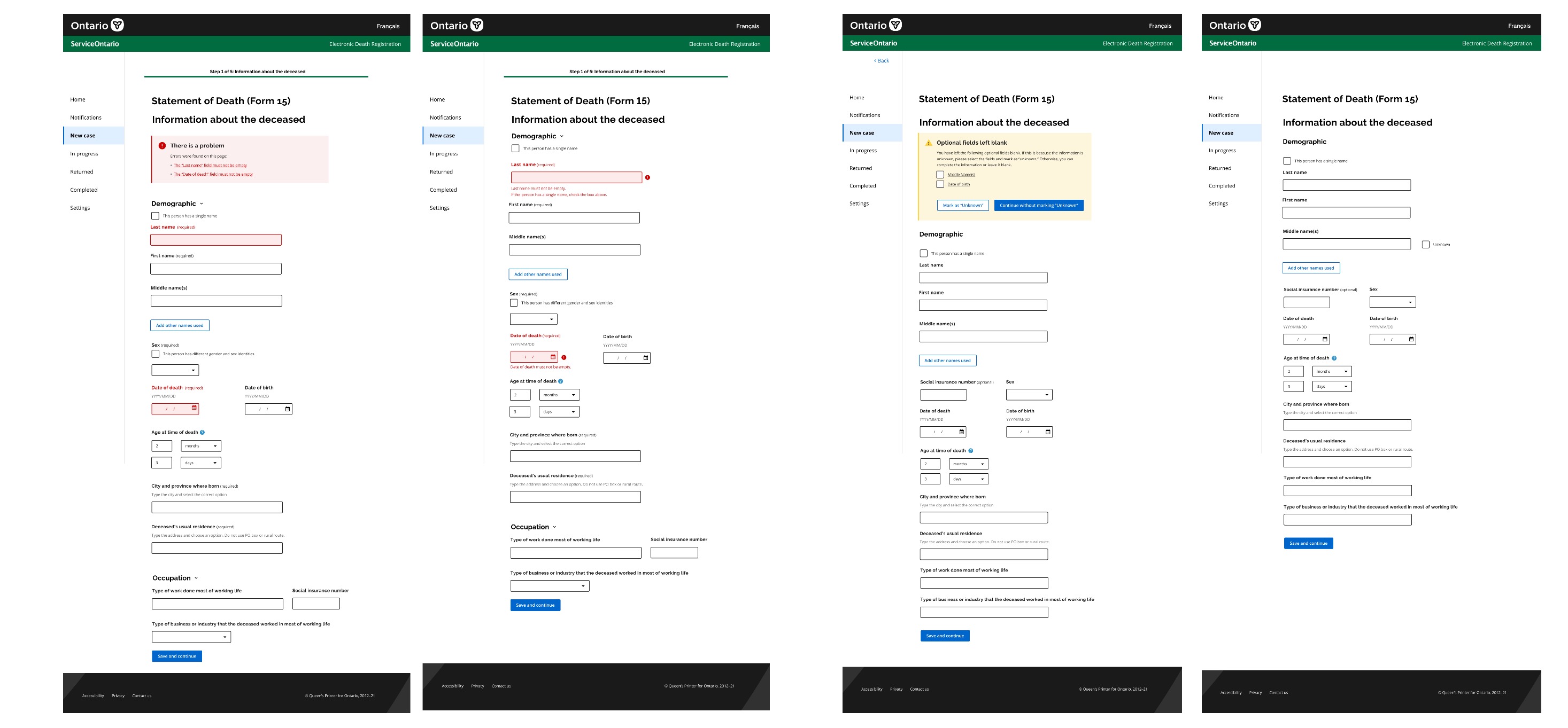
I developed and led usability tests with about 8 members of each of our user groups. Based on findings (ranked by severity and feasibility), we made changes to our final screens. Below are some examples of key changes:
We had to collect feedback from a number of internal stakeholders, ranging from the Office of the Chief Coroner, to policy/legal experts, the business team, program experts, and leadership. To limit meeting madness, I developed a process for stakeholders to share feedback in advance using Miro.
Product
Final
You can take a moment to step into a medical practitioner's shoes and explore the electronic death registration process. If you get stuck in the prototype, click out onto this text or the caption below it, and then scroll.
This flow, with some of the elements pre-filled, will guide you through creating your own Medical Certificate of Death. Blue highlighted elements are all clickable, if you get lost.
Payoff
Impact
This solution is currently active in the multi-year pilot stage, based on our final prototypes. Users in over 30 medical facilities and funeral homes in 3 communities across Ontario are trying out online death registration, alongside or instead of the existing process. The team awaits final results, but initial results looked promising...
- Saves users time: One of our key metrics was ensuring that a more comprehensive, error-bounded data entry process did not add extra time to form completion for users, who take as little as 5 minutes to complete a paper form. Based on usability testing and pilot results so far: form completion time decreased by as much as 70%, while the overall process completion time fell from weeks to days.
- Stakeholder support from all levels: The team received positive feedback from all levels (from assistant funeral directors to the Office of the Chief Coroner) about the solution. Both end users and leadership expressed optimism that it will save them time and help avoid errors.
- Attracted additional pilot participants: Our initial pilot participant recruitment was difficult, with some prospective participants and communities having been burned by non-starter pilot promises in the past. For this work, we were able to add 2 long-term care facility representatives and 1 additional funeral home to local pilot groups after they learned about the work from participating facilities in their communities.
Lessons learned
As always, I learned a few things from this work:
- Respect participants' time outside of your research: COVID-19 placed a lot of strain on the medical and deathcare communities. I had to adjust team expectations for user involvement in design, and be extremely flexible with our participants in scheduling and attending sessions. Every participant’s time is precious, but seeing the stress and understanding the sacrifices that our participants were making to care for others, made me very careful to focus on short sessions and research that we knew could be actioned quickly.
- Deathcare 101: Over the course of 6 months, I went from 0 understanding about deathcare and related processes in Ontario to subject matter expertise from the perspective of medical staff, funeral home staff, and municipal and government staff. This taught me to "learn how to learn" to get up to speed on not just the processes and regulation, but also the culture and context of a complex and emotionally difficult domain.
Made with <3 in Toronto and Seattle.